// Me Stuff //
5 things that you love to dorobotics, play in Photoshop, spend time with friends, write, read, though I can't often find the time
5 things that you hate to dohomework, paperwork, laundry and other chores, design based on other people's "good ideas", and babysit, as in, when people are supposed to be working on a task, having to sit there and make sure they get it done.
5 things you are proud of in your lifemy robotics team, winning the information architecture 2008 hacker award, my web design reputation, some of my art skills - more specifically my pixel art, getting a perfect score at the Mercer County Teen Arts Festival with my flute choir back in high school
5 things you are good atlearning new software, photo manipulations, writing good, helpful tutorials, pixel art, web design and coding
5 things that make you uniquemy broad range of knowledge, my ability to network without being intimidated, my outgoing nature, my design aesthetic, and my quirkiness - i know I'm a little weird, but I'm okay with that.
5 adjectives that describe youweird, fun, spunky, creative, smart
// Work Stuff //5 adjectives that describe your workoriginal, inspiring, bold, smart, clean
5 topics your work deals withsuicide/depression, robotics, art portfolios, vector-styled graphic design, pop culture
the media you use in your workPhotoshop - photo manipulation and pixel work, pencil sketches, Dreamweaver and Notepad2 (text coding)
Colors that you use most oftensilver, black, red, blue
5 emotions your work conjurespassion, excitement, shock, pride, joy
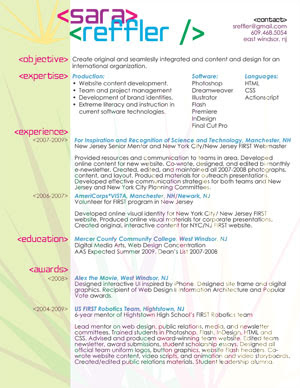
Titles of the work you would like to highlight"Alex" the movie
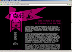
InToxicated
NYC/NJ FIRST
Paperdoll v. Riot
Paperdoll v. mixed up memories
Paperdoll v. Boggle
// Job Stuff //5 adjectives to describe the kind of company you'll work formodern, creative, casual, involved, original
5 adjectives to describe the kind of boss you'd like to havefun, inspired, creative, professional, encouraging
5 things you will have to do for your jobdesign, network, program, develop, communicate
5 words describing your industrycreative, original, intuitive, descriptive, helpful
List the reasons your job existsneed for communication, creating a visual identity, product sales, providing a flow of information