Ugh. I feel SO far behind in this class.. I'm going to do my best to catch up this week/weekend. At least I have no regional competition this weekend.
BUT Okay, I'm going with the cardboard box idea, because I think it'll be fun, interactive, and really push my limits as a designer. I think ultimately it will showcase all the things I'm good at - both the design and the coding.
Typeface: I want to create some kind of cohesion between my site and the resume I posted last week, so I want to find a way to use Discognate (the square font) as a header or something. If the site's flash based that's no problem, otherwise it'll be a matter of creating some images for it. Again, no big deal. Regular text I want to use either a Verdana/Arial/Trebuchet/Helvetica font-family or figure out the closest thing I can get to match Century Gothic.
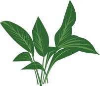
Line Style: I think clean vector illustrations is going to be my biggest success. It's Web 2.0 without being overly glossy and reflective - because honestly, I'm sick of that. I think that, because I have several elements that don't necessarily have a theme (ie boggle block, hazardous waste can, etc.) not using photographs will help create a cohesive identity.
An example of the illustration style I'm talking about:
I'm definitely going with your standard shipping cardboard box labeled with "This side up." I think I'd like a handwritten font on it that says something like "Sara's Stuff," though maybe something slightly more professional sounding.
Color Scheme: I want semi-realistic color choices - ones that are reflective of the sites they go with. So the boggle block will probably be a light cream with blue letters. The hazardous waste can would be pink and black, the iPhone would be, well, an iPhone color scheme. I might do some kind of gradient background to create the illusion of space, but I haven't decided. They are all going to need something to tie them together though - but I don't know what.
BUT Okay, I'm going with the cardboard box idea, because I think it'll be fun, interactive, and really push my limits as a designer. I think ultimately it will showcase all the things I'm good at - both the design and the coding.
Typeface: I want to create some kind of cohesion between my site and the resume I posted last week, so I want to find a way to use Discognate (the square font) as a header or something. If the site's flash based that's no problem, otherwise it'll be a matter of creating some images for it. Again, no big deal. Regular text I want to use either a Verdana/Arial/Trebuchet/Helvetica font-family or figure out the closest thing I can get to match Century Gothic.
Line Style: I think clean vector illustrations is going to be my biggest success. It's Web 2.0 without being overly glossy and reflective - because honestly, I'm sick of that. I think that, because I have several elements that don't necessarily have a theme (ie boggle block, hazardous waste can, etc.) not using photographs will help create a cohesive identity.
An example of the illustration style I'm talking about:

I'm definitely going with your standard shipping cardboard box labeled with "This side up." I think I'd like a handwritten font on it that says something like "Sara's Stuff," though maybe something slightly more professional sounding.
Color Scheme: I want semi-realistic color choices - ones that are reflective of the sites they go with. So the boggle block will probably be a light cream with blue letters. The hazardous waste can would be pink and black, the iPhone would be, well, an iPhone color scheme. I might do some kind of gradient background to create the illusion of space, but I haven't decided. They are all going to need something to tie them together though - but I don't know what.


Post a Comment