Sara R.
Need a resource for how to do a sitemap?
Jesse James Garrett: Visual Vocabulary
At the bottom of the page there's Powerpoint/Illustrator/etc. files to give you the images to create cohesion.
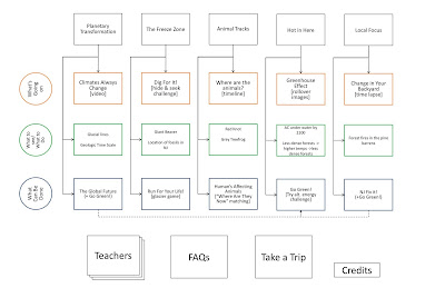
And here's an example of a finished sitemap:
Click thumbnail to view full pdf version.
Jesse James Garrett: Visual Vocabulary
At the bottom of the page there's Powerpoint/Illustrator/etc. files to give you the images to create cohesion.
And here's an example of a finished sitemap:
Click thumbnail to view full pdf version.

Sara R.
Ugh. I feel SO far behind in this class.. I'm going to do my best to catch up this week/weekend. At least I have no regional competition this weekend.
BUT Okay, I'm going with the cardboard box idea, because I think it'll be fun, interactive, and really push my limits as a designer. I think ultimately it will showcase all the things I'm good at - both the design and the coding.
Typeface: I want to create some kind of cohesion between my site and the resume I posted last week, so I want to find a way to use Discognate (the square font) as a header or something. If the site's flash based that's no problem, otherwise it'll be a matter of creating some images for it. Again, no big deal. Regular text I want to use either a Verdana/Arial/Trebuchet/Helvetica font-family or figure out the closest thing I can get to match Century Gothic.
Line Style: I think clean vector illustrations is going to be my biggest success. It's Web 2.0 without being overly glossy and reflective - because honestly, I'm sick of that. I think that, because I have several elements that don't necessarily have a theme (ie boggle block, hazardous waste can, etc.) not using photographs will help create a cohesive identity.
An example of the illustration style I'm talking about:

I'm definitely going with your standard shipping cardboard box labeled with "This side up." I think I'd like a handwritten font on it that says something like "Sara's Stuff," though maybe something slightly more professional sounding.
Color Scheme: I want semi-realistic color choices - ones that are reflective of the sites they go with. So the boggle block will probably be a light cream with blue letters. The hazardous waste can would be pink and black, the iPhone would be, well, an iPhone color scheme. I might do some kind of gradient background to create the illusion of space, but I haven't decided. They are all going to need something to tie them together though - but I don't know what.
BUT Okay, I'm going with the cardboard box idea, because I think it'll be fun, interactive, and really push my limits as a designer. I think ultimately it will showcase all the things I'm good at - both the design and the coding.
Typeface: I want to create some kind of cohesion between my site and the resume I posted last week, so I want to find a way to use Discognate (the square font) as a header or something. If the site's flash based that's no problem, otherwise it'll be a matter of creating some images for it. Again, no big deal. Regular text I want to use either a Verdana/Arial/Trebuchet/Helvetica font-family or figure out the closest thing I can get to match Century Gothic.
Line Style: I think clean vector illustrations is going to be my biggest success. It's Web 2.0 without being overly glossy and reflective - because honestly, I'm sick of that. I think that, because I have several elements that don't necessarily have a theme (ie boggle block, hazardous waste can, etc.) not using photographs will help create a cohesive identity.
An example of the illustration style I'm talking about:

I'm definitely going with your standard shipping cardboard box labeled with "This side up." I think I'd like a handwritten font on it that says something like "Sara's Stuff," though maybe something slightly more professional sounding.
Color Scheme: I want semi-realistic color choices - ones that are reflective of the sites they go with. So the boggle block will probably be a light cream with blue letters. The hazardous waste can would be pink and black, the iPhone would be, well, an iPhone color scheme. I might do some kind of gradient background to create the illusion of space, but I haven't decided. They are all going to need something to tie them together though - but I don't know what.
Sara R.
This is GENIUS! I wanted everyone to see it, because I was totally inspired by his work. And, of course, it only works because he's going into Infographics.
Sara R.
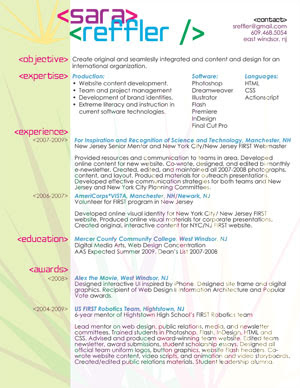
I wanted to get some fellow designers opinions on my resume, specifically on the metaphor usage of tags. Please let me know what you like and what you don't, and why.
I am most concerned about the left column of the document.
Click to view the full pdf.
Need opinions TONIGHT so I can print & use on Saturday!
Sara R.
Must have elements:
1. resume
2. bio
3. contact info
4. interactivity
5. complete pieces: screencaps, active links, etc.
7. the process - i want the elements that show how to get from point a to point b.
8. video - because let's face it, i talk too much.
I'm sure there's things I can't think of.
Leave a comment to help? Thanks.
Sara R.
So with this whole web 2.0 thing being huge, I wanted to try and come up with five concepts that provided the user with some interactivity. Even when you go for an interview for college or whatever and you bring a fine arts portfolio, the other person at least has something to flip/click through. I also am a big fan of creating 3 dimensional space on websites - using things like "poster tape" to create depth, creating the illusion of 3D. So that was my basis behind my 5 concepts.
1. Cardboard box -
Okay, so I have a bad tendency to design in boxes. So I wanted to throw myself out of the box, literally. I really liked Thibaud's Portfolio
2. A messy desk -
Kind of like OkayDave, but not as messy. He has EVERY part of that surface covered. I'd like maybe 6 or so elements: a computer screen, a mouse, a keyboard, a few fun stationary objects about my personality, etc. Click the computer screen, get a slideshow of screencaps. Click the keyboard, get information about my coding skills, click the...I don't know, photo of me, get my bio & resume. Click the mouse, get some silly mouse dance. Who knows.
3. Postered Wall -
Along the same lines of OkayDave, but mixed with my Cuttersclub design. Using more poster tape, some pieces falling off the wall, some pieces movie poster sized, some pieces magazine sized. Each piece could have some specific design element linking it to the information, which could pop up in a lightbox.
4. Find me! -
I'm okay with there being hidden elements, as long as the major stuff (ie resume, contact) are easy to find. But I don't know, maybe it'd be fun to have pop up divs that you have to look for. Like, the site I did for "Build your Own Robot" When you clicked on a gear, like "Base" a whole section of transparent images that you could click. Once clicked, the large version would appear on the screen and you could drag it around to position it yourself.
5. Tabs -
I liked the tabbed concept I did for my Flash website, and the Chanel redesign. I think it's a sleek, yet interesting way to break up the content. And, the tabs could be different sizes, or different materials or something like that.
Sara R.
Thought I'd share this with my other designer friends out there:
13 Most Desirable Collection of Free Resources for Every Designer
21 Typography and Font Web Apps You Can't Live Without
Background Pattern Generators
Creative Social Icon Sets
50 HQ Icon Sets
Free Photoshop Patterns
45 Free Design Template and PSD Files
Um...so wow. REALLY glad I decided to take a break from my newsletter project to read this when it popped up in my Google Reader.
Sara R.
InToxicated: Pixel Artist Portfolio (2007)
Objective: to create a website for a student pixel artist. Designed from only the title "InToxicated" and a pink/black color scheme.
Designed in: Photoshop CS3.
Coded in: Dreamweaver 8 and Notepad 2.
More >>
Initial drafts were created in a Firefox frame in Photoshop, playing with color modes (overlay and screen) to format the pink shapes in the corner. Monotone images were then masked inside the colored boxes to create the "cut out" look of the bottles and waste container.
Box frames were added second to identify the two major sections of the page - the navigation and the body. Catch phrase was added last to tie the two pieces together.
Content coding was done after the completed design, and text formatting was finished last. Link color was decided last based on the weight of the text color.
Sara R.
InToxicated - Viewing this website may be hazardous to your
Project: to create a website for a student pixel artist. Designed in Photoshop CS3 after meeting with the client. We decided on the name "InToxicated" for her site, and the color scheme of black and pink. Images were created using vectors and illustrations. Coded in Dreamweaver 8 and Notepad2.
Initial drafts were created in a Firefox frame in Photoshop, playing with color modes (overlay and screen) to format the pink shapes in the corner. Monotone images were then masked inside the colored boxes to create the "cut out" look of the bottles and waste container. Some edges were cleaned up using the brush tool - and probably should be cleaned and masked again using the pen tool.
Should consider transferring into InDesign or Illustrator to turn raster based images into 1-color vectors to create a more cohesive piece of work.
Box frames were added second to identify the two major sections of the page - the navigation and the body. Catch phrase was added last to tie the two pieces together. Content coding was done second based on initial Photoshop sketches and color scheme, and text formatting was finished last. Link color was decided last based on the weight of the text color.
I was actually surprisingly impressed with this piece, and the ability to come up with something that created an identity with almost no information to start. I was more disappointed when she never went live with her site, than I was with the design process. It's a little boxy, but it's not too bad - it's at least broken up with some choppy design elements.


